Friday, 30 April 2010

Kris English- Evaluation

In what ways does your media production use, develop or challenge forms and conventions of real media products?

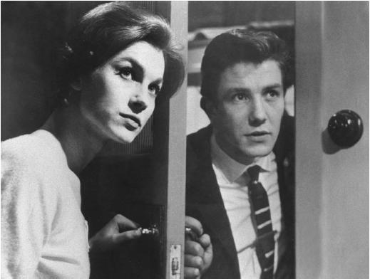
The title of our film is ‘Nearly Reunited’. The film focuses on two people, Daniel (Daniel/Ben Brown) and Sophie (Sophie/Nicole Laurie), who are desperately in love with each other but through there own faults never manage to have a relationship. We decided to make our film belong to the Social Realism class.

We decided to make a social realism film as we felt it best fitted in with our ideas and made it easier for us to put our messages across. Social realism usually deals with hard hitting subjects such as crime, so we thought that this genre was perfectly set up for us to tackle a hard subject like love. Social realist films are regarded as one of the big hitters in the British film industry and many say they keep the British film industry alive.

“Better than any other genre, social realism has shown us to ourselves, pushing the boundaries in the effort to put the experiences of real Britons on the screen, and shaping our ideas of what British cinema can be. While our cinema has experienced all the fluctuations in fortune of Hollywood's first export territory, realism has been Britain's richest gift to world cinema.” http://www.screenonline.org.uk/film/id/1037898/index.html
Here is a list of websites I used when I was researching social realism…

filmstudies.suite101.com/article.../social_realism_in_british_film
blogs.warwick.ac.uk/michaelwalford/.../british_cinema_social/
www.encyclopedia.com/doc/1O3-SocialRealism.html

How did your product use the conventions of social realism?

Overall I feel we stuck to the conventions of mise en scene closely and used them effectively. We managed to include….
Relevant settings to the time and location we where shooting.
Hidden messages and values that the audience have to uncover from looking at the body language of the characters.
Props that are consistent with popular culture (i.e. mobile phones, laptops, glamour magazines and iTunes)


However, I feel there where a few aspects of our film that didn’t conform well. For example, the lighting that we tried to keep as naturalistic as possible didn’t seem to work in certain scenes (i.e. Ben writing his letter and the split screen between Daniel and Sophie). Apart from this minor blip, I feel we did a pretty good job in sticking closely to the usual conventions.


How did our film follow camera work conventions?

In most social realist films, the camera work is fairly standard with an abundance of eye level medium shots. In our film we stuck closely to this and kept our choice of angles and frames simple. We felt that trying to make the camera work seem interesting and different would take away the fact that this was a social realist film. However, to vary it up a bit we threw in a split screen and filmed Ben as if he was looking in a mirror when he was getting changed. We felt this would keep the audience interested whilst also not forgetting the genre. The only thing that I think let us down in terms of the camera work was that we had too many long takes. This occurred because we where restricted to 5 minutes and needed to get a fair bit of information in, so our shots tended to be rushed and short.


How did our film conform to traditional editing conventions?
Standard editing in a social realism film is never amazing and dosent include loads of fades, dissolves or wipes, it is very much just simple straight forward cuts. During our editing process, we still wanted to keep the idea that this was more of a documentary than a film, so we kept the editing very simple and basic. However, we felt we needed to have a dissolve in the shot where the two people are growing up as it may not have been clear otherwise. As a whole the flow of our film is constant and this is due to the simple editing which doesn’t draw any attention away from the film.

Did our film conform to the sound conventions?
Just like in terms of the editing and camera work, the sound in social realist films is simple once again. The main sound you tend to get is always diegetic and adds to the atmosphere of the film. We knew that we needed to make our sound simple again to keep within the conventions of our genre. To do this we captured most of our diegetic sound on location with the video camera (apart from the birds tweeting). However, we used music to deliver our messages and get our points across. The whole idea for our film was to have the audience create there own interpretation about what is happening through the use of our music (non- diegetic sound).


What do social realism films try to say?
The main idea behind a social realism film is to give an audience of all different backgrounds a window to look into the lives of other people from different social classes. They also deal with hard hitting issues such as crime and youth culture. (For example Andrea Arnolds ‘Fish Tank’)


Representation in social realist films.
Social realist films represent people as normal people. They never have far fetched characters that are like a real life superman, they are normally working class people who struggle for money and have everyday problems to deal with. The characters always have something that people can relate to whether it be that they are struggling for money or that they are a single parent. The way these characters are represented is always in a way that makes them seem like a person you could see walking down the street.

Titles of social realist films

The title of these films seems to be of great importance to the overall marketing of the films. Firstly, the style of the titles (the way they look) is carried on not just on screen but with the film poster. Secondly, the meaning of the titles holds a key role in letting the audience know what the film is going to be about. For example, Andrea Arnold explained that the meaning of ‘Fish Tank’ is a reflection of how the main character, Mia, views her life. Our title gives a clear indication to our film as well. ‘Nearly Reunited’ gives off a sense of love, pain and disappointment, which is exactly what we where going for.

Narrative of our film
All films follow a basic set of rules for narrative, devised by Todorov. They consist of 3 simple steps….


1. Equilibrium
2. Dis-equilibrium
3. Re-equilibrium

Our film follows these steps closely in order to give it a balanced feel.


How effective is the combination of your main product and your ancillary task?


I think that both the poster and the review for our film are very good. Firstly, the review not only looks like a very high standard review for the magazine ‘Little White Lie’s’ but it also has an extremely high standard of vocabulary used. Nicole and Dani put a lot of work into the language and text in the review and me and Ben put a lot of work into the layout using in-design. Secondly, the poster was perhaps the hardest one to create and finally decide on an idea that we liked and was acceptable to the standards that we needed. We all created draft ideas for our film poster but in the end we decided to use Dani’s as we felt it was simple yet gave all the information the audience needed.


This was my draft idea for our poster.


Although my poster wasn’t used, I feel it was a decent idea because mainly it shows the distance between the two main characters. As well as that, it gives a clear indication of the emotion they are feeling due to the expression on there faces. What the audience can gain from this is that the two characters are either in love and can’t do anything about it or that there is something dividing the two.

What attracts our target audience to our poster? :

The target audience for our film was women aged 18-25. We felt this poster would be appealing to them because…

- The colours we used are neutral.

- We had a quote from glamour magazine, which is a woman’s lifestyle favourite.

As well as these points, Dani worked out that the poster we made has a lot of similarities to that of the film ‘Remember Me’, a film of the same genre as ours. The colour scheme, positioning of the characters, the style of the title and the placement of the actors names are all similar to ours.


What have you learnt from your audience feedback?
We felt the best way to gather feedback for our film was to use the social networking site ‘Facebook’. We decided this was the best method because hundreds of our friends, mostly of our target audience, use the site, so we could send them the link and then they could post there comments online for us to see.


The response we had from everyone was phenomenal and proved very useful when it came to talking about our strengths and weaknesses. Here is a list of what they said…


Positive:

Very good story line
Very good music
Good match on action
The fade showing them growing up was very good
Excellent shots of Ben getting changed in front of mirror
Brilliant quick cuts in the first scene where they are both listening to the same music
Nice idea using the same music at the end as a reminder to them both
The radio broadcast was brilliant and very funny

Negative
Some shots where too dark
The audience wasn’t given enough time to read the letter
Could have used a few more shots

There is a lot more positive feedback than negative. I feel our strongest points in this film where the use of sound, the editing techniques and effects we used. The shots people enjoyed the most where…

The fade


Shots of Ben


The negative feedback gave us an insight into what went wrong. Although to be honest upon watching our completed version, before we got any feedback, we knew that some of these shots where not very good at all. One of the major problems that occurred to us was the use of lighting. Because we wanted to keep the feel of a social realist film, we decided to use natural lighting but that turned out to be harder than we thought as some of the shots inside where to dark to register with the camera.


The comments about us not using varied shots and angles was not a welcome one. We felt the whole point of a social realist film was to make it seem simple so it is as if you are standing with the person watching what is going on. Had we put different angles and shot types in, I feel we would have lost our genre of social realism.


How did you use new media technologies in the construction and research, planning and evaluation stages?

Since last year I feel that we have learnt a great deal more about the technology that is at hand to us. There wasn’t that many new pieces of hardware for us to use, but the standard of filming and our knowledge of camera angles and shots improved greatly from our first project last year. Simple mistakes that where being made last year like not setting the white balance before a shot and not having a steady shot whilst using a tripod where all done away with this year.

My main task was to help everyone in different ways. One lesson I would be helping Ben with the editing, using Final Cut Pro, and then the next I would be helping Dani with the sound, using GarageBand and also a field recorder.
Final Cut Pro is a piece of editing software on the Apple Mac’s which we where encouraged to use this year. We began our editing process using iMovie, but we where told to switch to Final Cut as it had a much more advanced set up and more options in terms of effects. I personally found Final Cut Pro quite hard to use, so when I did help Ben with the editing I would sit with him and tell him my ideas whilst he put them into practice. Using Final Cut Pro, we managed to create the scene where the two characters grow up and also the split screen shot of the two younger characters.

GarageBand is another piece of editing software on the Mac’s, only this time it’s primary use is for sound. From our projects last year, I found GarageBand very easy to use. We used GarageBand to edit the sound of our film. For example, the music in the second half of the film was all created from different samples of sounds that you can find on GarageBand.


As well as GarageBand, we also had field recorders to capture our own sounds. We took advantage of this and decided to record our own track for the first half of the film. Me and Ben took a recorder and set it up and played the song that we wanted to have at the beginning of the film. Afterwards we uploaded the track to GarageBand and imported it into our film, after editing it to the right pitch and length we wanted.

In order to keep track of our progress, we had to constantly update our blogs. This was not a new piece of technology but it did provide us with a chance to work on a blog again from last year and do things differently. This time around the language I used on the blog was more of a traditional blog style (i.e. relatively informal) whereas last year I wrote everything as if it was an essay.

What we used (summary)
GarageBand
Final Cut Pro
Blog
Digital Camera

My role overall

My main task in making this film changed as we progressed through the production process. Firstly I was in charge of thinking up ideas for our film through research into the genre we chose to do. After I gained a few good ideas we adapted one of them to come up with the final idea for our film. Once we began filming, I was given the task of doing most of the camerawork, although I did share a lot of the work with Dani. During the filming process I would set the camera up, tell the actors what scene we where doing next, set the camera up accordingly and then shoot the scene. Finally, in the latter stages of the project, my main role was to help everyone. I would help Ben with the editing if he needed it and I was also able to help Dani and Nicole with the review. I feel I could have been doing a lot more than I did at this stage, but the group decided that they didn’t need that much help so my role was very minimal.

Monday, 26 April 2010

Ben Brown - Evaluation

Media Evaluation


1. In what ways does your media product use, develop or challenge forms and conventions of real media products?
-
For our A2 media project we were asked to produce a short social realist film with added sub genres if you wished.

We produced a 6 minute short social realist film with the sub genre of romance.

We decided to title the film ‘Nearly Reunited’, this was meant to represent the fact that there was a strong bond between a male and female character but no matter how hard they tried they never ended up together.

What are social realist films?

Social realism is the genre of film that recognizes real life and tries to portray these true to life events in a naturalistic and realistic way in a film.

“Social realism in films is representative of real life, with all its difficulties. The stories and people portrayed are everyday characters, usually from working class backgrounds. Typically, films within the social realist canon are gritty, urban dramas about the struggle to survive the daily grind” this was the definition given by http://filmstudies.suite101.com/article.cfm/social_realism_in_british_film

Our film follows the conventions of a social realist genre because it portrays the day to day problems of people that the audience can relate to rather than being unrealistic or fictional.


Ken Loach, Andrea Arnold and Mike Leigh are some famous social realist film directors. Their main aim is to concentrate on certain important themes/issues that people experience in their lives and to portray them in a film and represent and stereotype the characters in such a way you can relate to them.

Aims of social realist films
The aims of social realist films are to capture issues of the average person on day to day events, such things like unemployment, depression, uncertainty and many more things which people can relate to. Ms. Arnold,the director of Fish Tank, said: “I want to make it feel like we’ve dropped in on some people’s lives. With a lot of films, people are sitting on the outside looking in, but I want the audience to get a bit more intimately involved with what’s going on, so that they maybe can experience it a little bit more intensely.”

Some of the typical uses of Mise en Scene are

- Naturalistic light
- Ordinary (day to day) props
- Every day or regular themes and issues
- Usual and urban setting (working class environment)
- Costumes that try to represent their character
- iconography
- Desaturated colour

How we used, developed and challenged forms and conventions of typical Mise en Scene in social realist films


We conformed to the convention of using natural light. It worked well in our film, mainly in the shots that we took outside for example in the park.

Using natural light did not work so well sometimes because one night as it started to get late some of the natural light faded and some of the indoor shots where dark for example the one of Sophie below sitting on the sofa.


We thought very carefully about the standard props for out film. We tried to include typical things of young teenagers to have like mobile phones, but also tried to show that there was a different between the two mobile phones one being an old Nokia and one being a new Sony Ericsson which was trying to connote the fact there was a divide between the two characters, the girl being in a working class family and the boy being in a middle class family. Along with the other props like the computers and the radios and even the Xbox in the boy's bedroom. I think we did well to make our props suitable to the environment.

The costumes we used where appropriate for what we were trying to represent in the characters with just ordinary clothes like jeans.


We went against the usual social realist conventions in a film for the setting because we based our film more in a country side environment rather than an urban setting. We did this because we wanted it to seem like the characters are isolated in some way and lonely because there is not anyone else around them rather than being based in an urban setting which is crowded.

We tried to include as much iconography as we could. The main one was through the MSN conversation where at the beginning Sophie has a heart in Sophie’s name whilst speaking to Daniel but at the end when she says “I’m sorry Daniel” there is a broken heart in her name. We really did this is set the scene to show that she is genuinely upset about what has happened and to make the audience feel for both of the characters


Conventions of Editing

- Normally straight cuts (shows ‘real time’)
- Good continuity (doesn’t draw the audience’s attention away from the film)
- No unrealistic transitions

Did we follow the conventions of editing?

Throughout most of our film we just used the simple cut transition which shows that no time has passed and are unobvious to the viewer.


There are a few exceptions where we challenged the conventions of editing. I decided that instead of putting a cut transition I put a wipe in which was meant to clearly signify the slight moving forward of time, just to show how one person gets to a place without actually showing them getting there.
Also we used a dissolve to show the children getting older.


Even though these are not conforming to the regular conventions of social realist editing techniques they are still used in some films for example ‘Just Friends’ is a feature film which uses a dissolve similar to this. I think they worked well in our film and it was a good idea to deviate away from usual editing conventions in some parts of our film.

Throughout the film we tried to use a technique called cross editing which is when you keep switching to the same point in time to different people to see what they are up to and to see how they nearly meet.

Conventions of camera work

- Point of view shots
- Medium close ups
- Eye level shots
- No unrealistic angles
- Tries to capture facial expressions
- Simple camera movements

Did we conform to conventions of camera work?

We used a variety of shots in our film but the one we used most frequently was the medium close-up. This was so we could see the facial expressions of the characters to tell what their emotions are and their costume which tells you more about the character.


This is a split screen to show both the characters in the same shot and to show their facial expressions.

We also used some long shots which are quite common in real media products because it can be used to show how lonely and insignificant the character is feeling.


We used a few pans in our film which is only a really subtle camera movement to follow a character and is very common convention in social realist films.

Conventions of sound
- Naturalistic sounds (sound fx)
- Soft diegetic music (is any)
- dialogue

Did we stick to these conventions of sound?

We only used a few sound effects. The main one was when Sophie was texting with the bird song in the background but we did not have any dialogue at all in our short film.

The moods were done through diegetic and non diegetic music and communication through phones, computers and letters.

This defiantly does challenge the conventions of real media products because most of them rely on dialogue to tell the story rather than devices such as music and written notes.

We were inspired to do this by watching a short film called ‘Conversation Piece’ which tells the story through music instead of dialogue.

Overall I think we have challenged the conventions of real media products but have also used a lot of typical media conventions as well.


Todorov’s theory on how a film should be structured:
1. A state of Equilibrium (how the film starts)
2. A disruption of that order
3. A recognition that disorder has occurred
4. An attempt to repair the damage of the disruption
5. A return or restoration of a new equilibrium


This is the order that most feature films follow. The structure of short films can sometime be different, because of the lack of time in a short film they often end with a sad ending or a twist to keep the audience thinking rather than giving the audience the return of the equilibrium.

Our film does not end with a resolution to the problem, which when people watch it is quite a shock to them and they will be able to relate to feeling sad by the problem not being resolved because it is more representative of real life unlike the films where the problems are always solved.

Conventions of film reviews in Little White Lies magazine:

- Big picture
- 3 boxes with rounded edges, showing: the name of the film, The directors, actors and when it was released
- The first line of the text is in bold
- Follows the themes and style of the main film on the front page
- Page number
- Anticipation, enjoyment and in retrospect ratings

Did we conform to these conventions?

I think we conformed a lot to the conventions of real film reviews
- We took a snap shot of an appropriate moment in our film to put as the large picture

- For the three text boxes at the top with the title of the film, Directors, Actors and date released, I coloured them black, blue and gold. The colours that represent ‘Alice in Wonderland’
- I did this because all film reviews in the magazine ‘Little White Lies’ follow the same pattern and style throughout the magazine as the main film on the front cover (we created a rough version of the front cover just to make it clear).
- We also added extras which add to the ‘Alice in Wonderland Theme’ like the bunny ear down at the bottom next to the page number, and the car sitting just above the text.


Conventions of a film poster:
-Large picture of characters (representation of them)
- Large title
- Tag line
- setting in the background
- Reviews from magazine and newspapers
- Awards its won
- Actors names
- Names of the director

Did we stick to the conventions of film posters?

- I believe we did stick to the conventions of film posters
- The only thing that I think we slightly varied was the plain white background which we used to put even more emphasis on the representation of the relationship of the two characters.


2. How effective is the combination of your main product and your ancillary task?

- Along with the short film we were asked to make a film poster and film review for our short film. The aim of these two tasks was to promote the film to it's target audience and create a want to see ‘buzz’ for the short film.
- We decided that we wanted a 15 year audience age range in which to aim our short film. We finally worked out that the most appropriate audience and age group would be women from the age of 15 to 30 so we tried to attract that section of the audience through the film poster and review.

Poster


- On the poster there is a big picture of the two main characters within a white background. This will make sure that all the attention will be focused on the two characters rather than the background which is not as important and would just be distracting.

- The picture clearly shows the boy and girl touching hands which indicated to the target audience that it will be a romantic film involving those two characters.

- It also shows the boy is looking towards the camera and the girl is looking away. This will represent a dysfunctional connection between the two characters (a twist) which will make the audience want to watch and find out what happens.

- The red title also denntes love within the film, but along with the tag line "absence make the heart grow fonder" it is clear that it is only targeting females.


We looked at ‘Love Happens’ and ‘Remember Me’ film posters to get some ideas on how romantic posters are presented. We used some of the convections of this real media poster like the plain background to focus the audience onto the characters who are clearly together in the film and the clear title which instantly is set into the viewers mind.


We used symbols like the ones above to make this film poster seem more realistic and appeal more to the target audience. This has the benefit of making it looks more professional and being able to compete with other films.

‘Brown's best performance yet’ (5 stars) total film - This was the review we included from Total Film Magazine. This will appeal to the younger generation of our target audience because it’s more of a children’s magazine. Some people will argue that ‘Total Film Magazine’ is more for males and we are aiming at a female audience which is something we could have looked into if we had more time.
‘Great cast, great editing, great film’(5 stars) The Times – This is the other review we placed on the poster which is aimed at the higher and more sophisticated generation of our audience because The Times is a more serious newspaper.

- I think if we were to do the poster again we would think more about the reviews from newspapers we put on there because even though they are good reviews they are perhaps not the sort of newspapers and magazines that our target audience might read and therefore relate to.
PICTURE

- I think one other criticism of how the poster may not work with our short film is that we did not use the same style or font of writing in our poster as we did for credits in our short film.

- Even though I feel the poster worked very well in the media package for our film, there are a few things that we need to consider and reflect on.
Review


- For the main picture of the review we decided to use the main character Daniel sitting on a bench alone. This represents the constant theme throughout the film that Daniel is alone.

- He is only sitting on one side of the bench, this gives the audience some information, is he waiting for someone? Why is he sitting there looking around? Where is he?

- The audience may be able to relate to the way Daniel is feeling and will therefore create a reason in why they would want to see the film.

- The copy of the review is mainly for the older generation compared to the poster. It’s filled with text and longer words which would confuse the younger audience.

- Whereas the poster is very simple and colourful which is perfect for the younger audience.

- The copy shows some of the story line, about the children growing older and how they are ‘nearly reunited’ it manages to turn you against Sophie and feel for Daniel.

- ‘Brown's character is a subject of sympathy through out, his heart broken by Laurie’s inconceivably innocent yet pitiless character whose actions cause consequences that she does not contemplate’. This is a very meaningful sentence and can really set the scene for the readers. They can really get a good idea of the representation of some of the characters leading them to want to watch the film to learn more about them.

-Overall I think the film review and the film poster worked very well as part of the media package. They promoted the film well in giving them good reviews, followed a lot of the conventions of real media products, and gave the right amount of information in the poster about the relationship between the two characters and the genre, and the review represented the characters in detail and gave a rough outline of the narrative of the story.


3. What have you learnt from your audience feedback?

We managed to get most of our audience feedback from making a group on Facebook and adding our friends from our target audience groups.


The main positive points we got from the audience feedback were:

- good use of diegetic and non diegetic sound
- clever dissolves which show clearly the children growing older
- the radio station is a unique idea which worked well with the mood of the short film
- clever editing when it looks like Daniel is changing in the mirror
- clear story line without dialogue
- good continuity editing through out
- good representation of characters
- liked that there was no resolution (unpredictable)

The main negative feedback we received were:

- some of the lighting was a bit dark
- you could see the camera in the reflection of the window at the end
- there was not enough time to read the MSN conversations and the letter (could be quite confusing)
- The letter was unfolded on the floor when it had been folded through the letter box


We got a lot of good feedback from our target audience on how to improve on some things and what things were good.

The favourite thing seemed to be the mirror scene. They said it brought a bit of humour into the movie at the right time and made them laugh whilst still eager to know what was going to happen.

But the biggest criticism seemed to be that because we were trying to use natural lighting in some places in the short film the scenes were darker compared to the previous shots.

I think if we where to do our film again there would be a one major thing that I would take into account. We would plan to take all of our shot during day light hours so that we do not have the same natural lighting effect problem again, where the shot seemed too dark and in some places people struggle to see what is going.


4. How did you use new media technologies in the construction, and research, planning and evaluation stages?

Camera
I learnt many things this year about a variety of digital technology and its function.

A fundamental piece of equipment we used in the making of our short film was the video camera.

In one instance, the white balance was not set correctly giving us trouble shooting the shot which was a lot more orange than it should have been, resulting in us having to re-film that section.

We also had some trouble with a camera on how to turn the ‘fade in’ off. Apart from these two minor problems I think we were very successful in using the camera
equipment.

As a result of our mistakes we decided to set the white balance regularly and worked out all the fades and unique effects of the camera just in case we encountered problems in the latter stages of filming.

Voice recorder
We used a voice recorder to record the sound of me playing the guitar.
It took me a while to work out that you had to press the record button twice to start the recording and how to listen to it when you had finished recording. By the end it became easier to use and the sound quality was very clear, I was pleased with the outcome.


Editing software
We started off by putting our production into ‘I Movie’; the programme we used last year for our foundation portfolio.

We then decided that we should transfer our footage to ‘Final Cut Pro’ because it would be more suited to the level of editing we were trying to produce and we wanted to expand our editing skills further than just using I Movie.

‘Final Cut Pro’ also offers effects that help edit the white balance (colour) of your film and the lighting. One example is the shots of Daniel sitting on the sofa, we had to change the colour of the shots.

I found ‘Final Cut Pro’ simpler to use than ‘I Movie’ and it gave us a wider choice of credits with different styles and fonts to choose from in comparison.

Also I learnt how to crop. For shots like the split screen I placed the two images of the top of each other, and the mirror scenes it came in useful to bring the two sides in to create a mirror effect.


Garage Band
For adding sound effects we used ‘Garage Band’, there where little sound effects needed in our film but the few of the bird song and the doors slamming were positioned and work well.

Even though I find ‘Garage Band’ more complicated to use than software such as Final Cut Pro I think the sound we created on Garage Band worked very well.

Blogging
Every time we had a new idea or had updated our project we would write about it on the blog to show our input into tasks.

I found blogging useful in the construction stages because it helped me plan and know what I still had left to do and there were constant updates reminding me of the deadlines that were due.

Social Networking
We used Facebook as an easy way to contact our target audience for feedback on the film. It was effective as people just had to click on a link and watch the film and gave us evaluative points that we could use to write about what we could improve and what was good about our short film.


Photoshop
I found Photoshop very hard to use because it was the first time in a few years that I had used it.

When I became accustomed to it I found it a lot easier to use and it was very helpful when creating the film poster for our short film.

Indesign

I mainly used Indesign in creating the format for the film review. Placing in the text boxes for the copy of the review. Adding in the picture and all the little things like adding the picture of the cat and the bunny ears at the bottom next to the page number.

It was easy to use.

The thing that I learnt was that you had to click on 'place' to transfer images onto the page rather than 'open'. This caused problems early on but I got used to it.

Sunday, 18 April 2010

Evaluation - Nicole Laurie.

+In what ways does your media production use, develop or challenge forms and conventions of real media products?

Final Product;


Title: Nearly Reunited
Style: Social Realism
Genre: Romance (with a hint of comedy)
Certificate: 12A
Synopsis: Based on the strength of the relationship between the two characters Daniel (Daniel/Ben Brown) and Sophie (Sophie/Nicole Laurie), as they grow up and have to face the challenges most face when entangled in the emotion of love.


For our A2 Media Production we decided to complete a short film in the social realism genre. We chose to do a Social Realism film as we hadn’t completed one before and thought it would be a good chance to experiment with all our ideas combined.

Social Realism =

“Social realism in films is representative of real life, with all its difficulties. The stories and people portrayed are everyday characters, usually from working class backgrounds. Typically, films within the social realist canon are gritty, urban dramas about the struggle to survive the daily grind”
http://filmstudies.suite101.com/article.cfm/social_realism_in_british_film#ixzz0lRTpNxhx

“A genre of film which aim to represent the lives of ordinary people in ways that appear very ‘true to life’.” (Definition learnt in class)

This website gave me a better insight and more defined description of social realism : http://www.screenonline.org.uk/film/id/1037898/index.html


I found this powerpoint presentation whilst researching more information on social realism which I found extremely useful.

Social Realism -

Slide Four was particularly useful and interesting, as it displayed a timeline of a majority of the significant Social Realism films, and with it an explanation of the development of social realism in the film industry through each century.


http://www.youtube.com/watch?v=Wj9yvVDwhX0

This YouTube clip (print screen above - as the clip cannot be embedded ) of Celebrities/Critics and directors explaining Social Realism’s effect on the nation really gave me a good idea into the extent of just how much effect this genre had on the world of film; through comments such as:

- ‘The first generation of film to challenge me, upset me, irritate me and make me laugh’
- ‘Felt like somebody had been over my shoulder and watched my childhood grow up and pilfered bits and pieces from it’
- ‘Learnt more from watching two hours of (social realist film) about the world than watching the news in ten years’
- And a comment which stood out for me was that social realism enabled ‘literature, pop music and cinema to all converse together’.

INSPIRATIONS
We have had quite a few inspirations which have helped us create and develop our social realism film. Our main stimulation for our film was the short film “Mixed Tape”, which I have already analysed and detailed on the blog during the research period of the coursework.

Mixed Tape, Luke Snellin 2009.


We decided to take elements such as the storyline being based around ‘young love’ and the connection between two young children. But we chose to take it one step further by showing what happens to them when they grow up also. Another inspiration devised from this film was the use of music, we chose to uaw little dialogue and instead use the music, body language and expressions to represent the characters actions, feelings and personalities. Other ideas taken from this film were:
-Minimal character use
-None urbanised area
-Split screen to show both characters reactions

Another inspiration we developed was through the idea of the characters growing up and seeing the situation from both their young and older perspective. This was developed by both the film ‘Just Friends’ which has a similar storyline and also uses a dissolve to show the transformation in age.


- Conventions, aims and styles of Social Realism

Mise En Scene - (French term for "staging," or "putting into the scene or shot" meaning all the elements placed before the camera and within the frame of the film by the director)

-Recognisable naturalistic settings
-Naturalistic lighting
-Contemporary costumes/makeup for actors to fit their personality/character
-Ordinary and expected props/resources used in everyday situations/lifestyles
-Dominant features - hidden messages/meanings within objects/scenes (iconography)
-Realistic character placements and compositions - characters are often seen in context (e.g. social context or environment)
-Exterior settings and real locations, predominantly urban (especially establishing shots)
-Convincing costume and makeup for period and culture
-Desaturated colour palette


DID WE CONFORM TO THE MISE EN SCENE CONVENTIONS?
I think we did a good job of sticking to the conventions social realism mise en scene. As we managed to:
-Have real settings - the house, park, village etc

The park:


-Costumes - For both characters they were in suitable and standard clothes expected for their characters
-Props - Props used were believable for the environment and settings (e.g. the radio, the computer etc)

The radio:


-Dominant features with hidden meanings (iconography)- I think we did this quite well within the film, for example we tried to show the contrast in the main two characters social classes with the items they personally own (E.g. their mobile phones) We did this to fit in with the iconography convention, which emphasises the importance of props - which is a big element in the significant aim of social realism film to form reality.

Phones:
Old phone-

New phone -
Another interesting thing we managed to elaborate into our film was using the icon of a heart in the msn convosations to represent their relationship status. As you can see in the beginning convosations the heart is complete whereas by the end the heart is broken.


The only element of mise en scene I don’t think we conformed to as well as we could of done is the element of naturalistic lighting, because in some shots they were either too dark or too light, for example when Sophie enters the room after being at the park with her friend and Ben writing the letter sitting on the floor. The dark shot of Sophie walking into the room was an accident as we misjudged the time and didn’t recheck the white balance. Whereas the dark shot of Ben writing his letter was intentional, as we felt it outlined his activity more and added a sense of hesitance in what he’s writing.


But I don’t think this element would effect the audience to misinterpret the genre or style of the film, as it is still a clear image with clear movements from the characters. Furthermore, we went against one of the conventions of social realism purposely of filming in a urbanised setting, as we felt the more rural rustic approach fitted in with our story more, as you can focus more on the characters problems than the settings around them.

Camerawork
-Long takes as the actors usually have to improvise - creating a more authentic feel
-Sometimes hand held camera to provide a documentary effect
-Mainly simple, eye level shots with no complex angles and positioning to feel as if you’re observing
-Off centre framing to seem less manufactured
-Static shots, again as if observing

DID WE CONFORM TO THE CAMERAWORK CONVENTIONS?


With the aspect of using mainly simple shots at eye level I believe we conformed to this approach, as throughout we predominantly use eye level and medium close ups. Although we didn’t want the film to be filled with just these and therefore a little bit tedious, so we used the odd long shot and close up shot. We also departed slightly from the constant typical shots as we put in a split screen and a mirrors point of view shot. But the only thing we definitely didn’t stick to for the conventions of camera work was the long takes, as our film has many shots, which at times may seem a little crammed, if not hurrying our film on a little bit. But again, I don’t think this jeopardised the audiences opinion on the film.

Editing
-No complex or flashy editing so the audience aren’t reminded they are watching a film as they want to feel drawn in and can relate to the situation
-Good continuity between shots, usually through just simple cuts

DID WE CONFORM TO THE EDITING CONVENTIONS?
-We only really used simple cuts between each shot, except for the transformation as the two main characters group up, in which the screen dissolves. But without this dissolve I don't think it would have been as obvious what has occurred.
-Our continuity on the whole was good, except for the one exception at the park, as Sophie's bag was in a obvious different position in-between two continuing shots, so we had to fit in a random shot of the park, which I personally think doesn't look right and should of gone without it.

Continuity mistake:
Sophie was walking with her bag towards the bench to sit down with her bag still being carried on her shoulder


Then the next shot showed Sophie‘s bag being suddenly on the bench flat:


So we put this shot of the ‘park’ inbetween, but I don’t think we should of used it:


Sound
-Predominantly digetic, naturalistic sounds to maintain natural effect
-Ambient and synchronous sounds
-Accents connected to place

DID WE CONFORM TO THE SOUND CONVENTIONS?
- All our digetic sounds were believable and natural
We were inspired by the Short film ‘Mixtape’ (Talked about before) directed by Luke Snelling, to predominantly use the element of music to tell the story instead of dialogue, and then with the added help of body language, expressions and reactions. The song, ‘Wherever You Will Go’ by The Calling (below), is played in both a diegetic and non-diegetic sense, and plays an important role in dissolving the two time periods together, and exposing the audience to the lost but then found connection between the two characters.


With the big use of non digetic sounds, I think without them would have spoilt the film and with them have made a huge impact into the emotion and expressions created.

WHAT IS SOCIAL REALISM USED FOR?

Target Audience
An aim of a social realism film is to choose and aim towards the right target audience and meet the needs and expectations of this audience. Traditionally, social realist films were made to target a wider and more diverse audience - especially a youth audience, but as they tended to get screened at places where mainly middle class citizens went, this didn’t occur as much as planned.

Representations
-A key aim for social realism films is to illustrate the representations of the main characters as precise and accurately as possible.
-They aim to represent the lives of ordinary people (mainly working class or lower middle class) and underrepresented groups for the time of the production.
-They are committed to avoiding social stereotyping
-Attempt to make a positive representation of minority groups to make them more visible and understood.

Style
Our film also incorporates a romantic theme with a hint of comedy. If our film was to ever be universal, the type of characters I could imagine playing the main older actors would be Hugh Grant and Jennifer Aniston, as they have both evolved and developed as actors through basing themselves around the romantic-comedy genre (e.g. About A Boy and The Bounty Hunter).


But as our film genre is social realism, the norm seems to be that they use less well known actors for the main cast; this is so the audience aren’t judgemental or have personal opinions about the actors
Issues and situations beforehand and can focus just on the film. And most importantly it is creates a huge impact on the construction of social realism.

Themes and Issues

Social realism films aim to focus on issues which the audience can comprehend and sometimes even identify with, which are common situations and issues dealt with in everyday life. They are most often associated with:
-Social relations
-Money issues
-Working Class
-Current contemporary issues for the time
-Dominant ideology - often deal with and challenge real life issues reflected in themes
-Often quite serious and controversial but put into a optimistic light
-Less often represented in mainstream film

Earlier social realism films produced typically focused on issues such as unemployment, social status and the troubles faced in working class families.
Example - “Saturday night and Sunday Morning“ which is about hard-living factory worker juggles relationships with two women, one of whom is married to another man but pregnant with his child.
Yet in recent times the focuses are more commonly concentrated upon issues of youth culture - with topics such as gender, race and sexuality. (Example - ’Fish Tank, directed by Andrea Arnold)


I found a useful first part of documentary explaining the ‘1950’s revolution development and story of social realism’.


Watch The Story Of Social Realism [Part 1] in Educational  |  View More Free Videos Online at Veoh.com

This first part (and I felt main important part) of the documentary highlights some of the best and transforming social realism films (“Look back In Anger” (1959) which was credited as inventing Social Realism and ‘changed everything’.) and some of the most significant and film changing directors.

One of these being Mike Leigh, who is described as ‘a national treasure, who turns serious political films into something comically genius”.
Through looking at his profile on Wikipedia, I’ve discovered a lot more of his background and inspirations.


On here it says he “He starts with some sketch ideas of how he thinks things might develop, but does not reveal all his intentions with the cast who discover their fate and act out their responses as their destinies are gradually revealed. Initial preparation is in private with the director and then the actors are introduced to each other in the order that their characters would have met in their lives. Intimate moments are explored that will not even be referred to in the final film to build insight and understanding of history, character and inner motivation.” which really shows his attention to detail to get the social realism conventions spot on.

One of his main achievements is the well known award winning titles “Happy Go Lucky” which is one of the main social realism films we focused on in class.
Trailor:


Here he talks about his film and how he feels “the world that you film exists before you even go to film there”. He says how he goes against some of the conventions of social realism such as he “heightens colours and designs to express the positive and ‘happy go lucky’ spirit - which is quite a sophisticated decision”.


Furthermore, here is a interview with the main character ‘Poppy’ (Sally Hawkins) explaining the essence of her character and the underlying reasons and explanations to the interaction between the characters and her persona.


Ken Loach
Is known for his naturalistic, social realist directing style and for his socialist beliefs. He is identified as always emphasising genuine interplay between actors, to the point where some scenes in his films appear unscripted. His main aim is to represent the characters in the most typical and naturalistically expected way.

Here he explains his reasons for creating his film ‘Unchosen’:


He says:
“The idea for making it began years ago when it became plain that cities and society and the nations work were changing” showing his films are based upon personal experiences and how he wants certain situations to be portrayed (E.g. migrants coming into countries) and not only entertaining his audience but also educating them.

Titles
The title of social realism films seem to be a very important and significant part of the overall product, to not only allow the audience a taste of what the film inspires but also could have a hidden depth/meaning to it. For example, with Andrea Arnold’s film ‘FishTank’, as she explains in this Youtube clip below, the title ‘FishTank’ was a metaphor to emphasise how the main character Mia, lives her life and experiences.

Our title ‘Nearly Reunited’ gives the impression that the story is linked to love and a rekindled relationships troubles.

Narrative

Our film follows the theory of narrative created by Todorov, which, in it's most basic form, works through a series of 5 ‘transformations’


1. A state of equilibrium.
2. A disruption of the state of equilibrium through an action.
3. A recognition of the disruption.
4. An attempt to repair the disruption.
5. A return to the initial state of equilibrium.

Our ending does not fit the natural last part of the theory of narrative of ‘a return to the initial state of equilibrium’, as we decided to add a unexpected ending that Daniel rejects Sophie’s apology and their almost reunited connection breaks and ends. We did this as we thought it would be a interesting twist, and we thought it would fit the social realism ‘reality’ best. Because if this was a real life situation occurring to two real teenagers, the likeness of there being a happy ‘fairytale’ ending is very slim, so we decided to make the ending negative to fit the reality convention of social realism.


+How effective is the combination of your main product and your ancillary task?


I believe our two ancillary tasks, the poster and the review, were thought out and accomplished to a high degree of accuracy and would therefore work very well as part of a real marketing package and would do well as a real commercial context.

I decided to complete a draft version of my idea for the poster in Final Cut Pro. I was inspired through many posters I had researched into, but I had to take into account the fact that these posters are mainstream, high budget romcom’s and not for social realism, low budget films. Here are some of the inspirations:


This poster for Two Weeks Notice, inspired me to make the two main older characters be the main object in the poster. Furthermore, the inspiration of the characters both have a subtle but meaningful facial expression came from this poster.


This 'You’ve Got Mail' poster gave me the inspiration for the keyboard idea.

- Conventions of a social realism poster

-Attention grabbing title
-Picture of the main character/s
-Plain background to draw attention more to the image of the characters
-Witty useful tagline
-Review comments from other sources (e.g. magazines, newspapers)
-Any awards it’s won to attract the audience
-Actors names and director
-Sometimes a release date
-Subtle iconography or symbolism to draw in target audience

Our target audience
We had many discussions over what we should declare as our target audience. But finally, we decided to go for a older teenaged/young adult females between the ages of 18-24. We decided this on the basis that as our film has a romantic theme about lost love and connection, we thought this would appeal to a more feminine audience. We felt as our main older characters are quite young adults, people their age will be able to relate to their troubles, actions and consequences.


This was the draft copy of the poster I came up with and designed:

and this is the final draft I completed:


Here are some individual points about my idea and if it conforms the conventions of a social realism poster and ways in which it may attract our target audience:

- It includes all four characters (as the two main characters young and old) so viewers have an insight into the characters age and familiarise themselves to them.

- The page is split in half by a invisible line between the two characters to emphasise the main theme of the story of the divide and barriers between them and links to the split screen we have in our film.

-On the bottom half of the split poster will be the two characters as the younger age facing each other - to demonstrate that they are connected in someway in the film

-With the bottom half it shows how they are close and the top half show how they don’t quite reach each other.

-But with the top photo showing them touching hands, it could suggest hope.

-The background for the top photo is white, to emphasise their expressions and body language. This conforms to the convention, as we used a light background to highlight the main characters more.

-In the top right hand corner, there’s a keyboard which is used as iconography, as this is a symbolic and important part of the beginning and end of not only the film, but their relationship.

We chose to use Dani’s poster, as we felt it portrayed our film better and fitted to the conventions of a social realism poster better.
We were very dedicated to making our poster perfect, so changed our layout and elements within it a number of times to produce this:


Some of the points about this poster are:

- Our tagline, which is linked to the popular aphorism; “They say absence makes the heart grow fonder…” suggests there is a clear link between the characters, it also gives us the impression that this film is based on love over time. Furthermore, it indicates a love story - therefore appealing to a female audience.


- We used common logos to make the poster seem as realistic as possible.

- We used a female author for the film, which may be a subtle way to drawer in more female viewers.

- With the two main characters touching hands, this is a good indication that it is a romantic film - drawing in more of our target audience. Furthermore, as Daniel is looking towards the camera, and Sophie is not, it shows the detachment between their relationship, again drawing in viewers who would want to find out what happens between them.

- Simplistic colour scheme and background to emphasise the main image

- We used the letter 'R' in 'Nearly' for the word 'Reunited' then this would represent the idea of being to fit the theme and relate the title to the underlying narrative’s message. Furthermore, the title is red - symbolising the romantic theme.


- Used the female teenaged magazine ‘Glamour’ as a reviewer of the film to attract the correct audience and drawer in females.

Through all these points, we hope we have managed to capture the attention of our target audience - 16-24 year old young females.

Furthermore, Dani cleverly made a connection between the similarity of our poster with the newly released popular film “Remember Me” - a romantic film. For example the simple colour scheme, the placement of the actors names above the title, the colouring and font of the title and most obvious point of the two character being the main focus. This boosted our confidence that our poster is very realistically correct. But again, we have to take into consideration the differences, as this film featured in this poster has a different budget, audience and length of film.


REVIEW

For our review we had to complete a entire film review for our film in the exact style, layout and technique as the Film Review magazine - Little White Lies. I did quite a lot of research into this magazine so I could get a good feel on how to go about completing the review.

We discovered that there is a running theme of a particular film throughout the whole magazine, which is then reflected in the reviews. For example:


Star Trek Issue.


The Man On Wire Issue.

We decided to run our review in the style of the newly released film ‘Alice In Wonderland’ as we felt this would be quite an easy theme to intertwine into our review and it would also be beneficial as I think it would target our target audience quite well.

We even did a draft of what the cover would look like!


Conventions of a film review
- Large picture of a significant moment in the film or a image portraying something important to represent the film
- Three curved boxes in random arrangement which show the name of the film, the release date and names of the director/actors.
-Page number with a symbol to represent the film being themed in the magazine
-The first line is in bold
- Three rating of a scale from 0-5, anticipation, enjoyment and retrospect.

Did we conform to these conventions?
-We had a large image of the shot of Daniel sitting on the bench, we felt this was a significant moment in the film as it emphasises the fact that Daniel is alone
- We have the three curved boxes
- We used bunny ears, to fit the theme of Alice In Wonderland, for the page number.
-We completed the three ratings and gave in fair ratings and comments.

We also added a little extra, as some pages in an Issue of ‘Little White Lies’ would have a image on one of the characters or something to represent the themed film. So we decided to put a image of the Cheshire purple and pink cat from the film in the right hand side below our picture of Daniel on the bench. We also thought this would be a positive added attraction for our target audience.


As my main task for the film review was to complete the copy, I looked carefully at templates in magazines to get a feel for the right sort of language and tone used, and even did a personal analysis of the film ‘Nanny McPhee’


I think the completed copy of the review was very well constructed to appeal to the target audience and give the audience a feel for the film’s storyline and potentially persuade them to go watch it.

+What have you learnt from your audience feedback?
We got the majority of our audience feedback through setting up a feedback page through the social network "Facebook", we thought this would be the most appropriate way as it is a easy method of collecting opinions, especially from our target audience - 18-24 teenaged/young adult females.


From our huge collection of feedbacks, we discovered our main strengths and weaknesses:


Positive:

+Great original storyline
+Great soundtrack behind first half
+Good match on action
+Fade between kids from younger to older – very good (furthermore – mise en scene is really good here)
+Shots when Ben’s getting changed in front of mirror very good and looks very professional
+Good use of non digetic sound in the background and the editing
+Transitions are really well done
+First scene works really well where it switches between the two where they are sorting out the sound for the computer
+Clever how you brought back the same soundtrack from the beginning to the ending
+Good idea of having no dialogue in it
+The radio broadcast – unique and funny

Negative
-Letter shot – too quick so not enough time to read it
-Some of the scenes were too dark
-Could have muted some ambient sound when it switched to and from both of them (just after she walks away from the door)
-Could have varied few more shots
-When Sophie is texting its clear it was done at night and the boy receives the text in broad daylight!

Evidently there is more positive feedback than negative. But from what has been said I’ve learnt that our strongest points and elements of our film were the sound choices, original storyline and ideas for shots. From the audience feedback, I’ve learnt that our best shots seem to of been:

The fade between the two characters


Shots of Ben getting changed:


The first few shots of Sophie/Daniel speaking online:


Looking at the negative feedback, there are clearly a couple of things we should have taken into account and if we had the time, would have definitely improved.
Many people have highlighted how they didn’t feel they had enough time to read the letter and some of the msn convosations. Although
my group have tested it ourselves, this has been seen as a problem so if we had the chance we would have definitely made that shot longer.


A big problem we seemed to have was the lighting of some of the shots, as many turned out to be too dark. For example, the scene when Sophie comes home and texts Ben and the scene when Ben is writing the letter;


This was partly due to the fact we had limited time to do some scenes, as most of the filming days were done after college late in the evening, and the times varied therefore the lighting and naturalistic light varied.

The comment that was made about how we could have varied the shots more didn’t go down well with our group, as we felt we had used a variety of shots and ideas! We didn’t want it too varied as we felt that wouldn’t fit the social realism conventions.

My favourite and most helpful feedback comment was:

“I felt it conveyed a real conflict of emotion taking viewpoints from both genders and all available viewpoint not leaving the viewer in any sort of suggestive or assuming mood. The film exceed...s expectation vastly on media work and this illustrates great quality in the ability you guys have.”

Overall, our group is very happy with the feedback we got and found it useful and enlightening on our strengths and weaknesses.
From taking into account all our feedback from our target audience, I would say we’ve definitely met the needs and reached the high expectations of our audience.


Also we are very proud having reached over 300 views of our film on YouTube!


+How did you use new media technologies in the construction, and research, planning and evaluation stages?

I feel I have developed a lot of skills in using digital technology, especially in comparison to the Foundation Portfolio last year, and have successfully expanded these to make an positive impact on the overall short film. These include:

Final Cut Pro


We decided to make a advance from the foundation portfolios by transferring our rushes from the programme iMovie to Final Cut Pro - a more sophisticated and precise editing software - which we felt would be beneficial to use. Although more advanced, Final Cut Pro was reasonably unproblematic with getting used to and consisted of several effective techniques, for example devices which can change the lighting/composition of certain shots and then a wider variety of transactions (dissolves, fades etc).


Through using Final Cut Pro’s technology we got to incorporate impressive feature such as merges, mirror point of views and a split screen.

Split screen:


Mirror point of view:


This was an extremely useful website which helped us with a couple of problems we had when trying to understand and use Final Cut Pro:
http://users.design.ucla.edu/~jbishop/FCP/FCPtutor.htm#Editing

The main useful parts was how it tells us how to use the transitions for our dissolves as you can see here:
=


Other useful parts it helped us with the ‘rendering’ section, the tool palette description and the effects list.


We also used a couple of Youtube Final Cut Pro tutorial’s to help us when there wasn’t a teacher available to help:


And to help us change our lighting as that seemed to be a big area of our film we needed to alter:


Indesign and photoshop


Using Indesign and Photoshop - I used this software to complete my draft version idea of our poster. Creating this poster on these software’s wasn’t as difficult as I anticipated. The fact we had already done some practice designs of magazines last year probably helped. I easily got the pictures of the younger characters through screen grabs on Final Cut Pro which I transferred to the relevant computers.

-It was easier than I thought to insert the image of the keyboard and altering the angle, but through placing a image saved on the computer through Google images, and then tilting it 90* through the rotating tool it worked out fine.


- Titling and font using was very simple, as long as I used the correct layering techniques and paid attention to the fonts I used throughout.


- The trickiest part I would say was cutting out and transferring the image of the two older characters. We took the photo through a normal digital camera then put this onto Photoshop. Then after sizing it properly and altering the quality of image, I used the lasso and wand tool to cut them out. And after a lot of patience, time and concentration I managed to cut it out very precisely and then transfer it to the main poster in InDesign.